I am a blog minimalist myself, but the site navigates well. Of course, the most important aspect of a blog is its content. Thank you for your unique contribution to the biblioblogosphere.
Yeah, Joel, think about the title color burst. I would prefer a little more business-like appearance if it were my blog. I think it looks too much like candy, or a little kid’s blog. You might want to use a single color there, maybe that nice blue you have in the horizontal dividing lines. I do like the colorful box the post is in. Maybe that’s enough color.
Other than the title color burst, I think the new appearance is great!
Did you change it a bit while I was posting my comment? It looks a little more muted now. (Of course, at my age I could be imagining it!) Just keep playing with it until it pleases you eyes, Joel.
Verdana ain’t my favorite font; too Microsoft-centric — I’m a Mac and Linux user. Gill Sans is nicer to read. The colors play havoc with my Mears-Irlen Syndrome; color sensistive dyslexia. The tags at the right are too intrusice and in many cases truncated. I think my AdBlockPlus, GreaseMonkey and Stylish add-ons to Firefox will be called into play to make the content readable for me.
Recent posts from my Ancient Wisdom, Modern Lives:
Why We Need Ancient Wisdom Today People crave advice, but mostly they get modern-day snake oil. That's why we need ancient wisdom now more than ever. Here's what I mean.
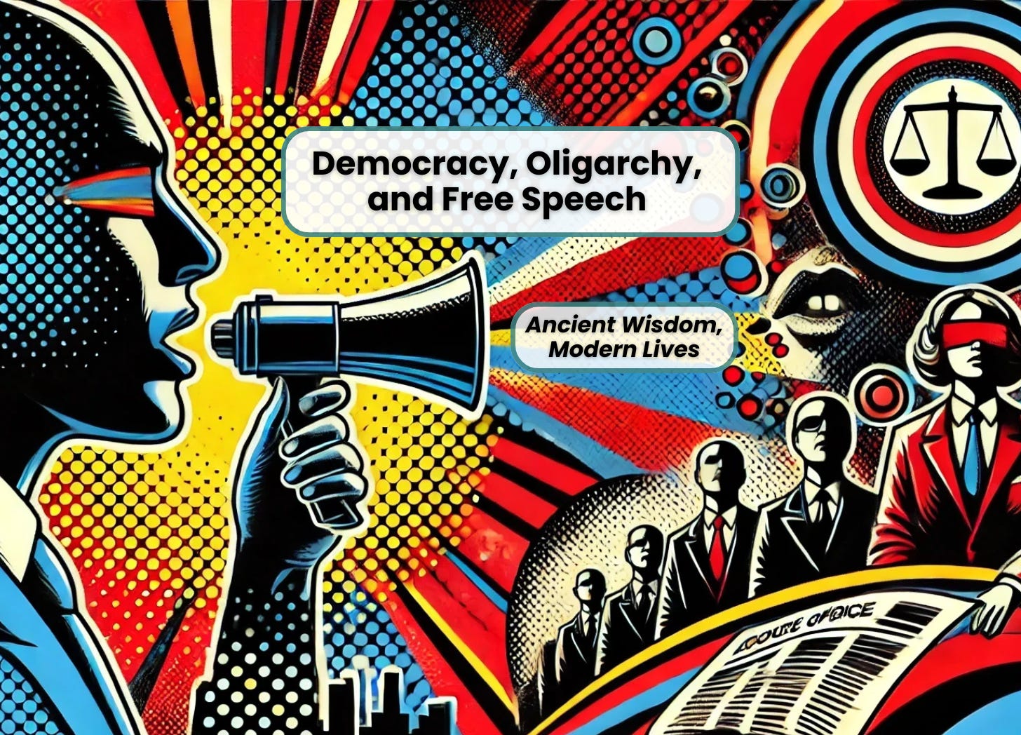
Democracy, Oligarchy, and Free Speech An oligarchy replaces a democracy and a public figure is put on trial for his words. History or current events? Or both?

8 Responses
I am a blog minimalist myself, but the site navigates well. Of course, the most important aspect of a blog is its content. Thank you for your unique contribution to the biblioblogosphere.
Thank you for your kind words.
I like it – not so much the title colors. Too much, but the nice fades had a great touch
Okay. We’ll see if I keep the color burst. I’d like to have something colorful somewhere on the page.
Yeah, Joel, think about the title color burst. I would prefer a little more business-like appearance if it were my blog. I think it looks too much like candy, or a little kid’s blog. You might want to use a single color there, maybe that nice blue you have in the horizontal dividing lines. I do like the colorful box the post is in. Maybe that’s enough color.
Other than the title color burst, I think the new appearance is great!
Did you change it a bit while I was posting my comment? It looks a little more muted now. (Of course, at my age I could be imagining it!) Just keep playing with it until it pleases you eyes, Joel.
Nope. I haven’t changed it in the past 12 hours.
And I’m a demanding customer — it will never fully please me….
Verdana ain’t my favorite font; too Microsoft-centric — I’m a Mac and Linux user. Gill Sans is nicer to read. The colors play havoc with my Mears-Irlen Syndrome; color sensistive dyslexia. The tags at the right are too intrusice and in many cases truncated. I think my AdBlockPlus, GreaseMonkey and Stylish add-ons to Firefox will be called into play to make the content readable for me.